Hunt Visuals · Brand system V2 · August 2026
Look like the business
you've actually built.
The identity Adam Swain built, plus the working rules that came out of applying it. If something here disagrees with an older doc, this wins.
One wordmark. Gold as standard.
The wordmark is a custom mark, not a typeface. Never rebuild it in type and never redraw it.

Primary, web gold
The default everywhere. Lighter at the top edge, a touch deeper at the foot.

White
Only where gold would compete: over imagery, or beside a gold headline.



The h icon
Avatars, favicons, watermarks and anything too tight for the wordmark. The circle is the default: the gold sweep h at half the disc on ink, with a thin gold ring. Browser tabs get a version drawn for 16 and 32px so the ring stays sharp. Black h on the gold tile where it sits on a light ground.
Using it
- ✓Clear space equal to the height of the H on all sides.
- ✓Minimum 120px on screen, 25mm in print. Below that, the h icon.
- ✗Never recolour outside white, black or the brand gold.
- ✗Never stretch, rotate, or add shadows, glows or outlines.
Black ground, two accents.
The brand lives on near black. Gold is the loud accent and green is the working one. There is no third accent and no red, except a cross marking something negative.
Black
#000000
The default ground everywhere.
Ink
#080B12
Cards and raised surfaces.
Steel green
#233033
Backgrounds only. Never text, never a fill.
Web gold
#F9E4BB → #F6DEB2 → #EDD09C
Headline accents, the primary CTA, chips and every gold detail on the site. The VSL gold as it looks on screen. Rare by design.
Classic gold
#705836 → #E5D097
Retired on the site 23 Sep 2026, logo files included. Still on proposals, emails and decks until they move over.
Green gradient
#386359 → #91C1B2
Secondary buttons, ticks, live states, tier two.
The gradient rule
- ✓Green gradients run 135 degrees, dark into light.
- ✓Web gold runs top to bottom as a near flat metal: a lighter top edge, the gold, a touch deeper at the foot. Never the old dark to light stretch across a word, it reads flat and brown.
- ✓Start and end on the exact hexes. Brightness comes from a mid stop.
- ✗Never run one gradient light into dark while another runs the other way.
- ✗Never use steel green as a flat accent. Flat green comes from the light end, #91C1B2.
What the eye hits first.
Six rungs, loudest at the top. A section uses three of them at most and only ever one rung 01. This is the part that stops a page reading flat.
Web gold
#F6DEB2, lit top edge
The one thing on the screen. One phrase per section, never two.
Flat gold
#F6DEB2
Secondary emphasis on the site. Text on video is #F6D08F in the edit, charts take the graphics palette.
White
#F2F2F2
Headlines and anything that has to be read.
Brand green
#91C1B2
Interactive and system. Buttons, ticks, live states.
White mono, 60%
#F2F2F2 at 60%
Structure. Eyebrows, labels, counts, footers. Never an accent.
White, 70%
#F2F2F2 at 70%
Body copy. Present, quiet, never competing.
Repeating grids
- ✓In a row of cards, rank with the label, not the headline.
- ✓Escalate a set of tiers plain, then green, then gold, and lift the top one.
- ✗Never give every card in a grid a gold phrase. Six golds means nothing ranks.
Three fonts, three jobs.
Served from the Adobe Fonts web project. The desktop files are for rendering images locally only, self-hosting them on a site is against Adobe's terms.
001
New Hero + Begum
Headline, with one italic accent word
002
New Hero
Subheads and body
003
Darkmode Mono On
Labels, data, buttons, footers. Always caps, wide tracked
From 11 to 200+ students, 5 new team members, and multiple studios
The pairing.New Hero carries the headline and the body. Begum italic takes one word, never a full line. Darkmode Mono handles every label.
Diana Cojocar · Dance
Caps as texture
- ✓Set anything in caps in Darkmode Mono, tracked at 0.14em.
- ✓Lead a long paragraph with two or three words in gold mono caps to break the wall.
- ✗Never set an eyebrow label in gold. Labels are structure, so they drop to 60%.
Buttons, pills and surfaces.
Contrast does the work, not saturation. This palette is quieter than a bright accent, so lift comes from a glass sheen, a real shadow and a weighted ramp. One chip, one button, each at three volumes, and the volume is the only thing that changes.
Gold fill
The one thing you most want pressed. One per page, and nowhere else.
Gold stroke
Second on a live page. First on anything static: a deck, a thumbnail, a video frame.
Ink
The quiet one. Ink with a breath of steel green, mint hairline. Available without asking to be pressed.
Green fill, email only
Gold gradients do not render in Outlook, green does. It never appears on a page or in a video.
The chip · same ladder, smaller
Ink
Furniture. A tag, a location, a chapter, a role. Gold dot, white mono caps. One word can go gold. New Hero for a label in sentence case.
Gold stroke
The one thing in the row that matters. A flag, a CTA pop up in a video, the middle tier.
Gold fill
The loudest. The top tier tag, the end card of a video. Ink text on it, never gold on gold.
Fill is ink #080B12 at 90% blending to steel green #233033 at 78%, 135°, so it never reads as solid green. Stroke 1px mint at 26%. Dot #F6DEB2 on the site. Mono 10 to 11px caps at 12% tracking. Worked examples on real footage, with the video sizes: episode graphics reference.
Do
- ✓Gold fills the single most important action. Gold strokes the next one. Everything else is ink.
- ✓Weight fills dark so white text has something to sit on.
- ✓Give cards a top light and a real edge so they lift off the ground.
- ✓Ground the page in black with soft steel green and ink blooms.
Do not
- ✗Flat green fills. Anything solid green takes the gradient.
- ✗Black text on green. White, always. And never gold text on a gold fill, it reads faded.
- ✗Heavy glow behind gold. It should read as lit, not neon.
- ✗A pure flat black page. It reads dead.
Shot, not stocked.
Founders at work, real shoot days, real results. Graded dark and moody so the gold and white type cut through.
Do
- ✓Deep shadows and filmic contrast, backgrounds crushed toward black.
- ✓Frame the subject with space for type.
- ✓Brand thumbnails through the accents, headline gold and marks green.
Do not
- ✗Tint whole photographs to a brand colour. Faces stay real.
- ✗Bright flat stock, fake bokeh, AI visuals.
- ✗Anything from the retired blue, red or yellow palettes.
Everything on top of the footage.
Captions, keyword pops, graphics, timelines, lower thirds, end cards. Same system as the rest of this page, with one difference that decides most of it: nothing in a video can be pressed, so gold is a stroke, never a fill.
Content text · settled 23 Sep 2026
Lloyd and Ryan set this on the VSL. It is the text on every piece of content: the VSL, ads, micros, reels, shorts and the website. Where anything further down this section disagrees, this wins.
Keyword pop
- Font
- New Hero SemiBold
- Size
- 80 to 100
- Tracking
- -60
- Colour
- Flat gold, no gradient
- Effects
- Drop shadow (softness 50%, opacity 100%), Bevel Alpha, Light Sweep, Deep Glow at a tight radius
Auto captions
- Font
- New Hero SemiBold
- Size
- 48, about half the keyword
- Tracking
- -60
- Colour
- White
- Effects
- Drop shadow and a tight glow, pulled back by eye wherever it looks glowy
- ✓The keyword is gold, not yellow. If it tips yellow over dark footage or a black shirt, lighten it a touch by eye. Light and premium is the aim.
- ✓The Light Sweep lands with the word. The white sheen starts as it pops up, not a second after.
- ✓Keep the glow tight to the letters. If it spreads down the frame, bring the Deep Glow radius in.
- ✓Pop the whole point at once. “400 shoots”, “£60,000”, “two new fitters” land as one unit in one style, never word by word.
- ✓With the sound on, the pop is the point, not the sentence. “£60,000” on its own beats “£60,000 of my own money”.
- ✓Short lines that sit still long enough to read before they change.
- ✓Line the speaker up with the captions. If they sit off centre for a long stretch, punch in and reframe.
- ✓Shorts with one speaker: white captions, the keywords in gold at the same size. Two speakers: the host in gold, the guest in white.
- ✓Shorts framing: straight to camera stays full 9:16. Podcast, BTS and anything shot tight goes 16:9 inside the 9:16.
- ✗No quotation marks on pop ups, and no decorative shapes. Crosses, circles and squares are not the brand.
- ✗No underline on a name like The Enquiry Hunter. Just the words.
- ✗No gradient stretched across a line. It goes flat and dark. The gold is flat, the sweep and bevel make it metal.
- ✗Not the thick round font from the first VSL cut, and not Europa Grotesk. Everyone uses it.
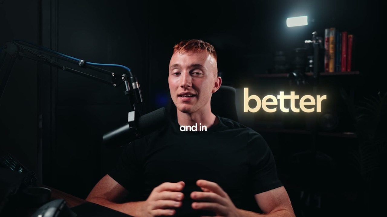
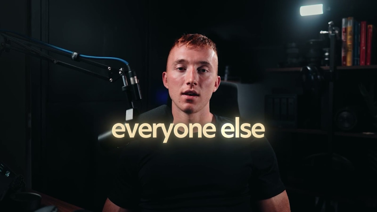
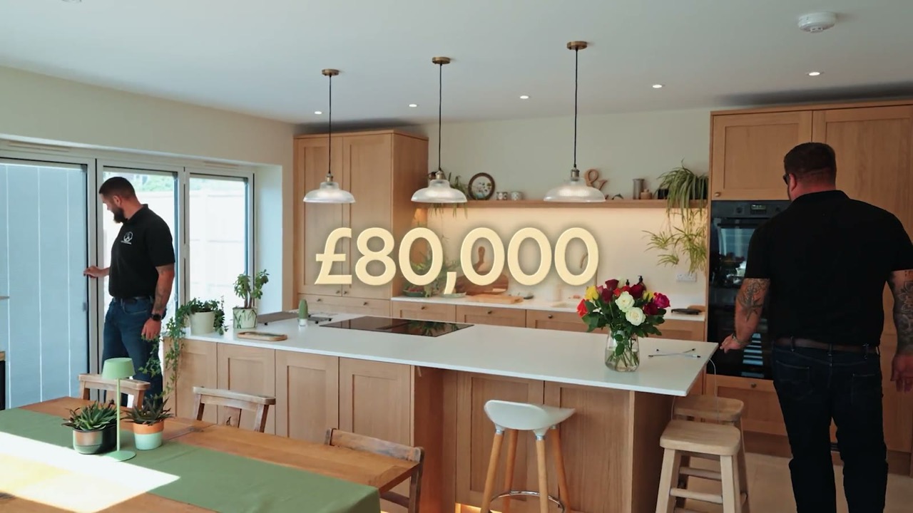
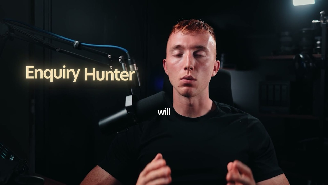
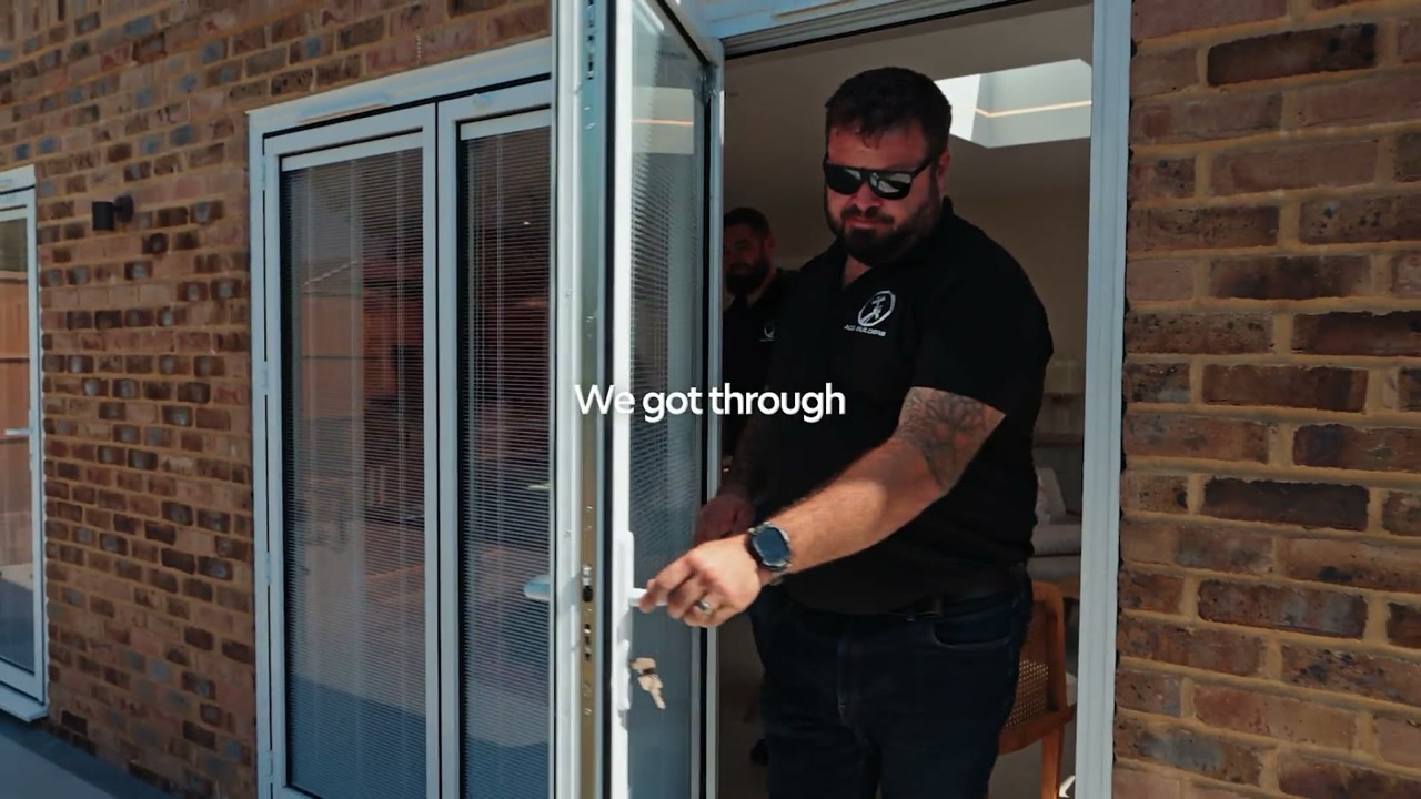
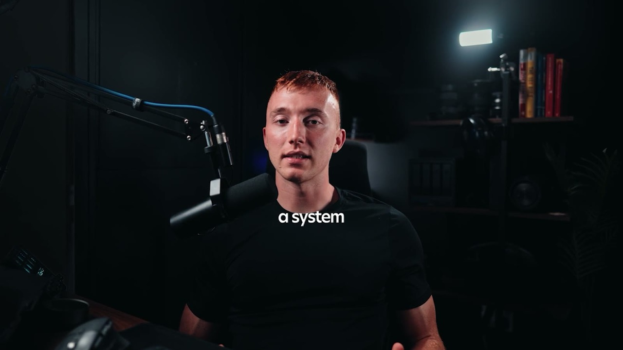
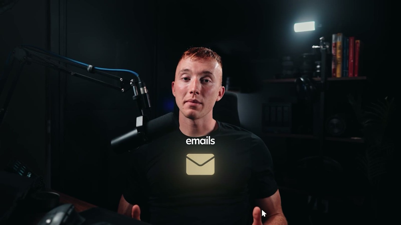
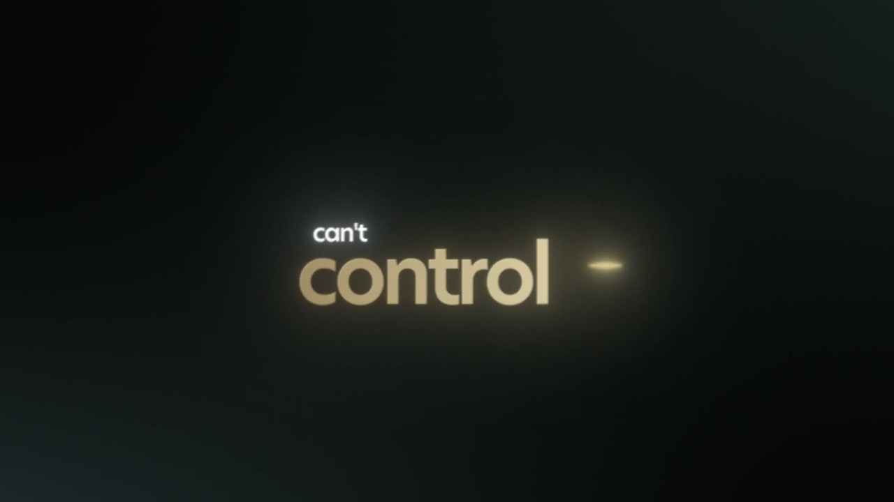
In the edit, set #F6D08F. The bevel and the sweep lift it, so on screen it reads as #F6DEB2. On the web, where there is no bevel, use #F6DEB2 so the gold matches the video.
Look like the business you've actually built.
On the web · the sweep plays as the word scrolls in
On the web
- ✓Gold words are the web gold #F6DEB2, what #F6D08F looks like on screen once the bevel lifts it.
- ✓Each gold word gets one Light Sweep as it scrolls into view: a white sheen and a glow lift that settles back, about a second, starting once the word has faded up.
- ✓It plays again when the word comes back into view. Anyone set to reduce motion sees it still.
- ✗Never a sheen on a loop. It lands with the word, the same as a VSL keyword, then stops.
The swap
Blue keyword pop
White caption, the keyword in flat gold #F6D08F
Blue funnel, bars, charts
Gold on the subject, green on everything else
Blue neon glow
Warm gold bloom, 30%, no hard edge
Blue timeline or progress
Gold on the live point, white 25% on the rest
Filled blue chip or pill
The ink chip, gold dot. Gold stroke on the one that matters
Bright red marker
Only the negative thing, and in #8C3A34
Short form, 9:16
Same frame, same grade, same photo. Only the treatment on top of it changes.
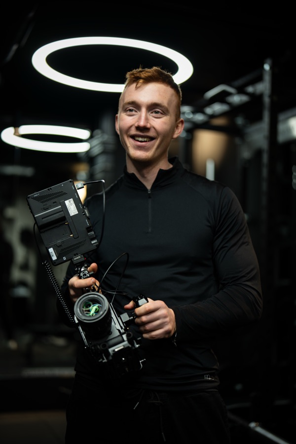
Your brand looks small online. Your business isn't.
Was · blue burned in, everything glowing

Your brand looks small online. Your business isn't.
Is · white caption, the keyword in gold
- ✓Auto captions are New Hero SemiBold 48, tracking -60, white, with a drop shadow and a tight glow. One line, centred, never over the face.
- ✓With one speaker the keyword goes gold inside the caption line, same size, #F6D08F with the sweep and glow. On the VSL and long form it pops on its own at 80 to 100, beside the speaker, while the captions carry on.
- ✓Two speakers: the host's captions in gold, the guest's in white, so the viewer always knows who is talking.
- ✓Chips are for labels, offers and the CTA. Never on a spoken word.
- ✓Progress bar is a hairline. Gold on the live segment, white 22% on the rest.
- ✓The h icon as the watermark, top right at 60 to 70%, never the full wordmark.
- ✗Never a filled chip for the handle. Gold stroke with a gold dot.
- ✗Never a glowing progress bar. It is furniture, not the message.
YouTube episode, 16:9
Long form carries furniture the reels do not: chapter markers, lower thirds, recurring title cards. On a 20 minute episode a viewer sees these dozens of times, so they go quiet.
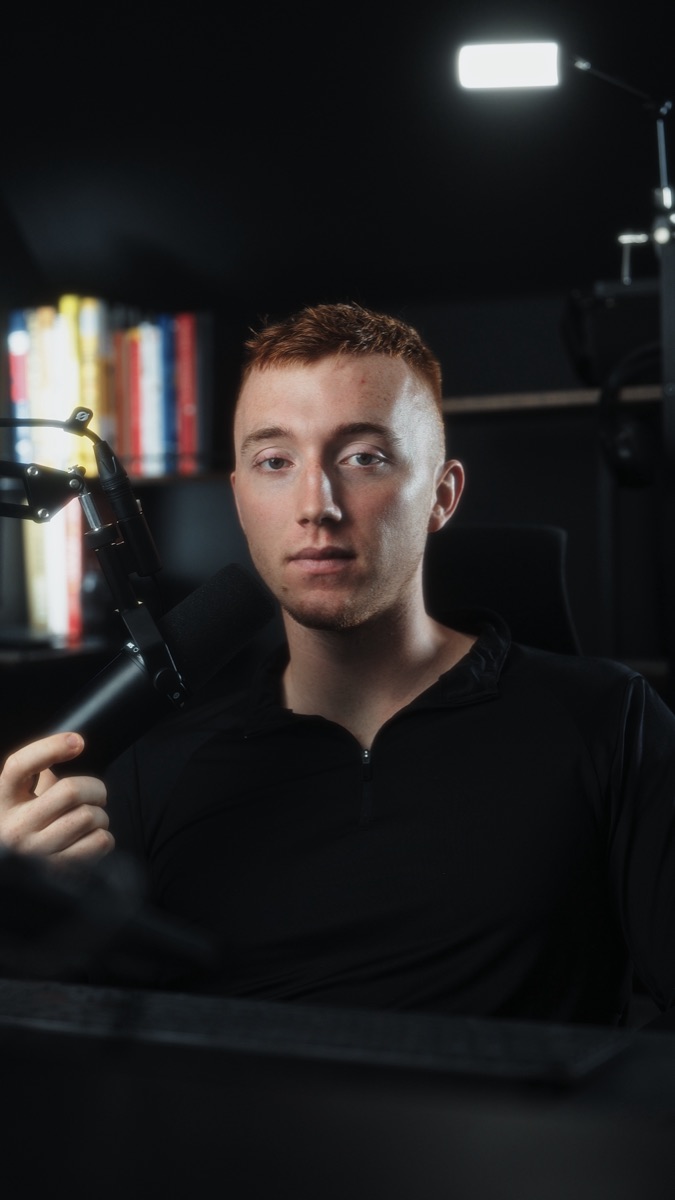
Was · filled blue blocks, glowing
01 · The problem
Lloyd Hunt
Founder, Hunt Visuals
Is · a gold rule, mono caps, the rest recedes
- ✓Lower third is the name in New Hero with the role in an ink chip under it. No panel behind the name.
- ✓Name at full white, role at 55%. Opacity does the ranking, not a second colour.
- ✓Chapter marker, location and stat label are the ink chip, mono caps, gold dot, one word can go gold.
- ✓A title or caption is white New Hero with one word in Begum italic gold. A stat is the number in white with the unit in Begum, chip under it.
- ✓Anything a viewer sees more than twice loses its glow. Repetition is the test.
- ✗Never a filled block behind a name. The chip holds the role, the name sits on the shot.
- ✗Never a second accent colour for chapters. The number carries it.
Captions
Book more jobs
Was · blue keyword, neon glow
Book more jobs
Is · New Hero SemiBold, the keyword in flat gold
- ✓Every format: New Hero SemiBold 48, tracking -60, white. The keyword in flat #F6D08F. See Content text at the top of this section.
- ✓Titles, stats and end cards keep Begum italic gold on one word. Captions and keyword pops never use Begum.
- ✓The gold lands on the beat the word is said, never before.
- ✓Drop shadow at softness 50%, opacity 100%, plus a glow that hugs the letters. Pull the glow back wherever it looks glowy.
- ✓On white or a pale ground, type goes black and the word takes the deep end of the ramp, #705836 to #C9AE6B.
- ✗Never a whole caption in gold, except the host in a two speaker short. Never two lines.
- ✗Never a coloured stroke or outline on caption text.
Glow
Gold glows. It just glows as light instead of as neon, and that is a settings difference, not a ban. Neon is a tight bright halo with an edge you can point at. Brand light is a wide dim one that falls away to nothing. Same effect, different radius and opacity.
Booked
Was · blue neon
Booked
Wrong · gold, dialled like neon
Booked
Right · gold as light, flaring then settling
The settings
Where it goes
- ✓The lift: on the gold thing itself, so it reads as emitting rather than pasted on.
- ✓The bloom: behind a graphic, on the ground, roughly the width of the object again.
- ✓The flare: peak at roughly 3x the resting glow for 4 frames, then ease back over 6 to 8. At 25fps the whole thing is done inside half a second.
- ✓Flare on the land, never on the exit. It switches on, it does not switch off.
- ✓Green can bloom on a background. It never lifts a shape.
- ✗Never a wide glow on white text. Captions get a shadow and the tight glow from Content text, nothing bigger.
- ✗Never glow two things in one frame, and never in two colours.
- ✗Never a glow on a stroke, a chip, a rule or a progress bar. Furniture stays flat.
Building the flare
Frame counts are at 25fps. Every frame below is drawn from the real values, so what is on this page is the spec rather than a picture of it. Eyedrop it if that is faster.
more
Frame 1
In, no glow
more
Frame 2
Peak, 3x rest
more
Frame 6
End of the hold
more
Frame 10
Easing back
more
Frame 14
Rest, and holds
Glow against frames
Straight up, flat across the hold, curved on the way down. The rise is linear because a light hits instantly. The fall is eased because nothing in the real world stops dead.
In the edit
Save it as a preset the first time and drop it on every gold word after that. It is the same eight steps whether it is a reel caption, a chapter number or a stat.
- ✓One flare per frame. Two golds flaring at once and neither one lands.
- ✓Land it on the beat of the word, not on the cut.
- ✗Never flare on the way out. The word leaves at the resting level.
- ✗Never lengthen the hold to make it read more. Raise the peak instead, it is 4 frames.
Graphics palette
Charts, funnels, bars and diagrams take solid colours off the two ramps, not the gradients themselves. A gradient inside a small moving shape reads as a mistake. Tap any value to copy it.
The one thing that matters
Its supporting part
Depth and shadow side
Deepest, edges only
Everything compared against it
Second series
Third series
Deepest, edges only
- ✓One gold per graphic. It is the thing you want them to look at.
- ✓Everything it is measured against goes green, or white at 20 to 40%.
- ✓Ground every full frame in black with one soft bloom, steel green #233033 or ink #080B12.
- ✗Never both ramps competing at full strength in one graphic.
- ✗Never a flat pure black frame with nothing in it. It reads dead.
- ✗Never a fifth colour. If you need one more series, use white at a lower opacity.
Diagrams
Was · every stage the same blue
Is · green feeds it, gold is the outcome
Timelines and progress
Was · red start, blue everything after
Is · gold on the live point, the rest recedes
The dot the voiceover is on takes the gold and moves down as it is spoken. Everything ahead of it stays white at 20 to 40%. Red is only ever the thing being called out as bad, and it is #8C3A34, not a bright red.
On real footage
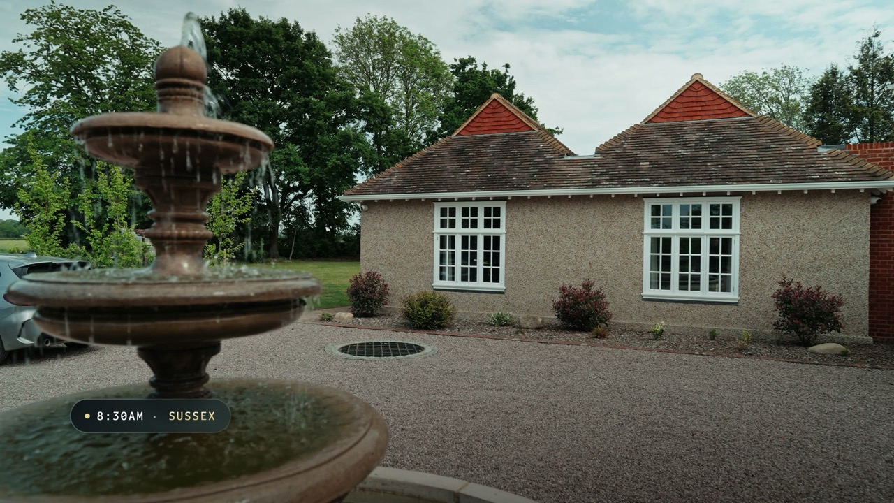
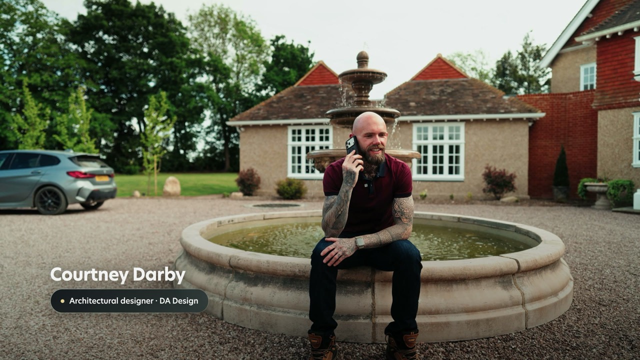
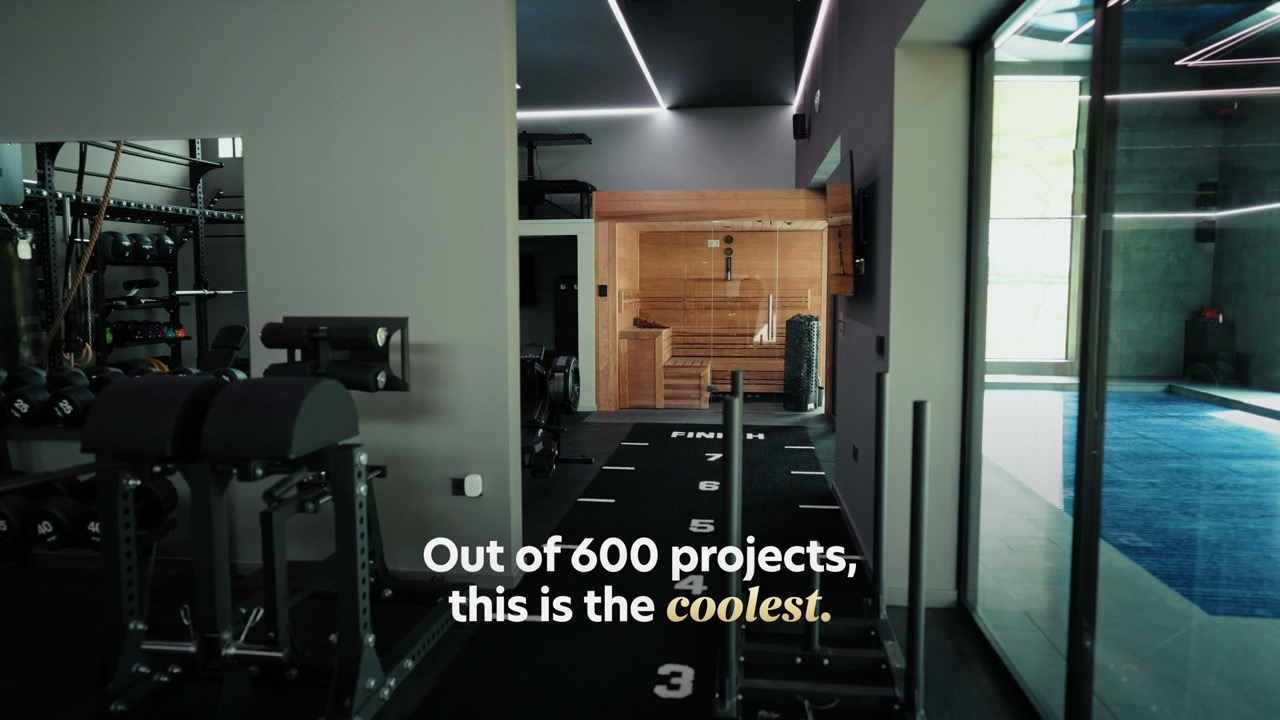
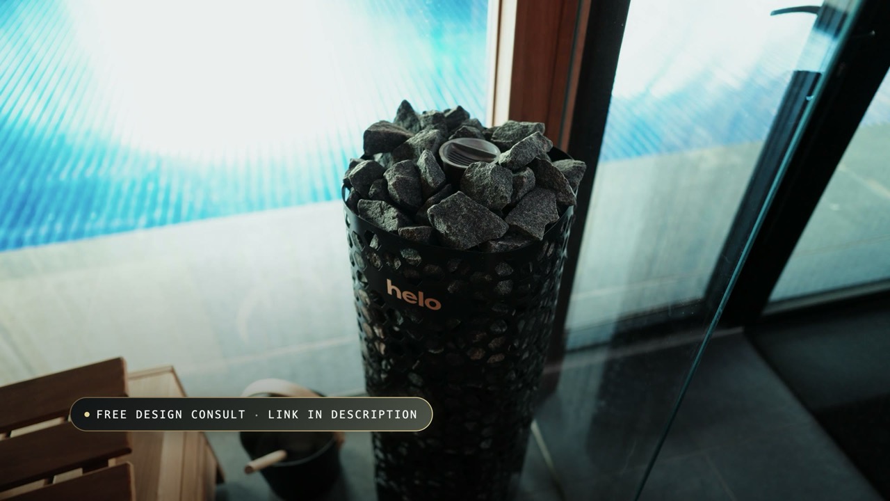
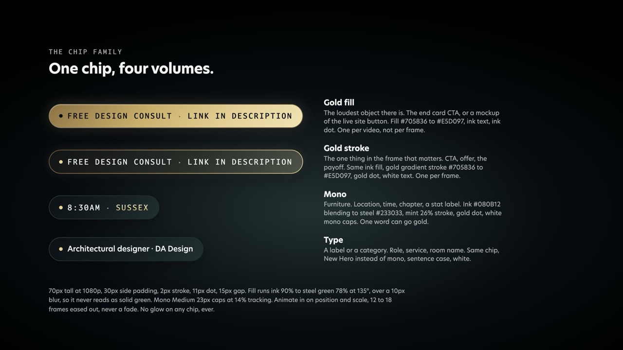
Chips, lower thirds and titles at 4K, for the editors (caption and keyword values there are from before 23 Sep, use Content text above): episode graphics reference.
Lower thirds, stats and end cards
Lloyd Hunt
Hunt VisualsLower third · mono caps, gold stroke chip
4,000+
Videos delivered
Stat · number gold, label mono
Look like the business you've actually built.
End card · Begum on one word only
- ✓Every pop up is the same chip: ink fill, gold dot. Gold stroke for the one that matters in the frame, gold fill once per video, on the end card.
- ✓A big number can take the gold gradient. A sentence never can.
- ✓Begum italic on one word of a title or end card, matched in weight to the New Hero beside it.
- ✗Never two gold fills in a video, and never gold text on a gold fill.
- ✗Never a filled blue or green chip for a name, a role or a label.
Footage and screen recordings
- ✓Grade dark and filmic, blacks crushed, so gold and white type cuts through.
- ✓Frame a screen recording in a rounded card with a 1px white 10% edge, on black.
- ✓Point at things with a gold stroke box, 3px no fill, or dim the rest to 40%.
- ✓Light leaks, flares and transitions are warm. Gold, never blue.
- ✗Never recolour a screen recording or tint a face. Real screens, real skin.
- ✗Never a highlighter fill over UI. It is a stroke or a scrim.
Keeping it engaging
The old edit got its energy from saturation. This one gets it from timing, scale and depth, which hold up far better and never date.
- ✓Change something every 2 to 3 seconds. A punch-in counts as a change.
- ✓Make the emphasis big. Scale contrast reads louder than colour ever did.
- ✓Animate in on position and scale, 12 to 18 frames, eased out. Not a fade.
- ✓Build a graphic on one element at a time, in step with what is being said.
- ✓Put it in space. A bloom behind it and a slow scale drift stop it reading as a sticker.
- ✗Never more than one idea in a graphic. If it needs a key, it is two graphics.
- ✗Never gold on every pop. Save it for the payoff or none of them land.
Fonts, for the edit
New Hero, Begum and Darkmode Mono are licensed through Adobe Fonts. Sync them in Creative Cloud and they appear in Premiere and After Effects like any other font. Do not download them from anywhere else and do not substitute a lookalike. If a font is missing on a machine, the export waits.
Founder to founder.
A straight talking founder who has been in the trenches, genuinely cares about the result, and speaks to clients as peers.
Always
- ✓Short punchy sentences, lead with the point.
- ✓UK spelling. Colour, organise, realise, programme.
- ✓Second person. Real, and swear when it lands.
Never
- ✗Corporate speak. Leverage, synergy, paradigm.
- ✗Influencer bait. POV, game changer, tell me why.
- ✗Em dashes or double dashes as punctuation, anywhere, ever.
Power phrases
You're doing great work. Nobody can see it.
Your vision. Our systems. Done for you.
One high authority video beats 30 vanilla Reels.